Art 241
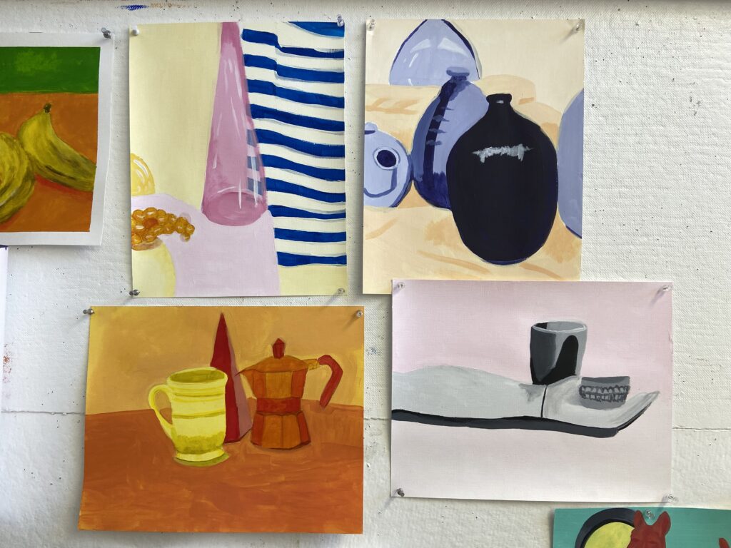
For the top left painting, I chose a warm color palette with one cool color, the blue striped fabric in the back. For the top right painting, I chose a complementary color scheme, between the purple of the vases and the orange of the fabric. For the bottom left, I chose a warm, analogous color scheme. Finally, for the bottom right, I chose a monochromatic color scheme.
I ran into quite a few problems with this project. It was the first time I had worked with acrylics since high school, so I had forgotten all of my technique. I also have never been very inclined in the way of still lives, so that was another challenge. I had trouble getting the opacity I desired, as well as the smoothness of line quality I usually have in my work. The one I finished last, the top left, is the most successful. By the time I finished that one I was beginning to understand the medium better.
As I moved to the next painting, I had relearned how quickly acrylic dries and was able to compensate for that. I was also working the muscles that had gotten out of shape- how to interpret shadow, highlight, and color, as well as how to orient a still life on the page. I also remembered how problematic acrylics can be if they start to get sticky, which I struggled with for both paintings on the right.
As a whole, I struggled with this assignment, and I think that is evident. The bottom two are really unsuccessful to me, especially the bottom right. The legibility is poor and I really struggled to get the values and shapes right, as well as as the placement of the objects on the paper. On the bottom left, the paint is sheer and patchy, the pencil lines show through, and all of the objects are in the middle of the page. The top right is very mediocre to me, but shows that I was gaining understanding of the medium. Again, I see the top left as the most successful of the four. I think that the glass vase has dimension, as well as the grapes.
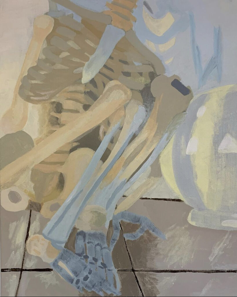
I began this painting with a sketch, and then with a thumbnail practice of the color scheme that I was going to use. The colors that really stood out to me in the still life and in my picture of the still life were the yellows, blues and tan shades. I exaggerated the yellows and blues to give the still life more intensity. My biggest struggle with this project was getting the shapes to be clean, as well as getting the correct colors and creating value. This project was really a learning curve for getting back into acrylics, as well as practicing value and color.
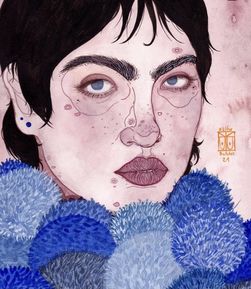
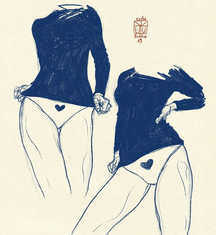
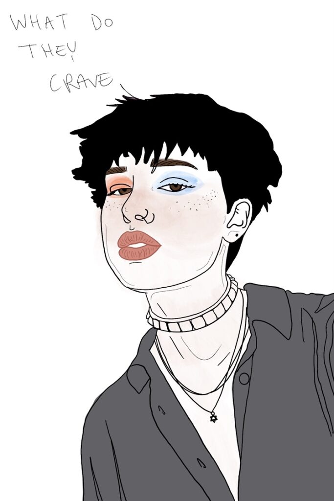
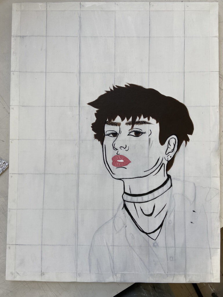
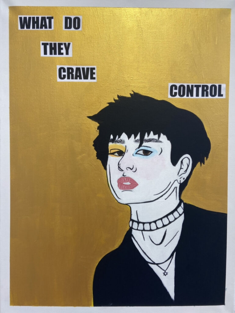
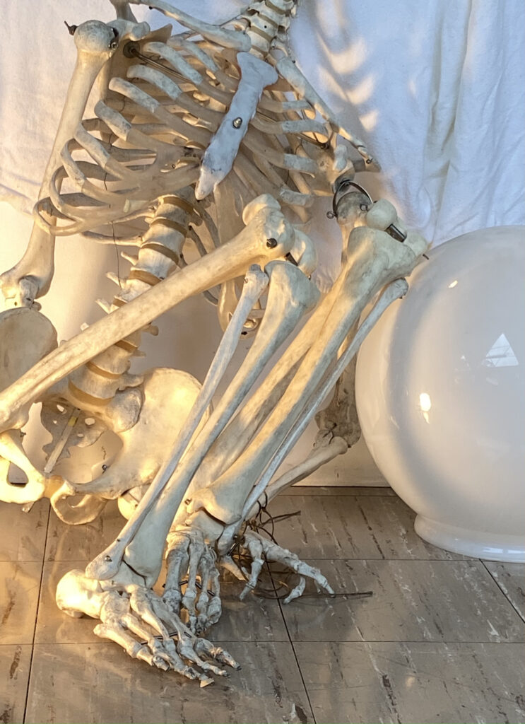
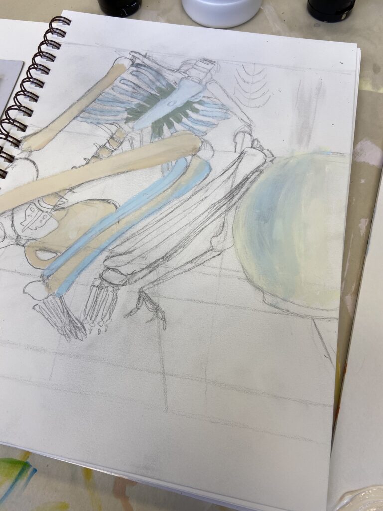
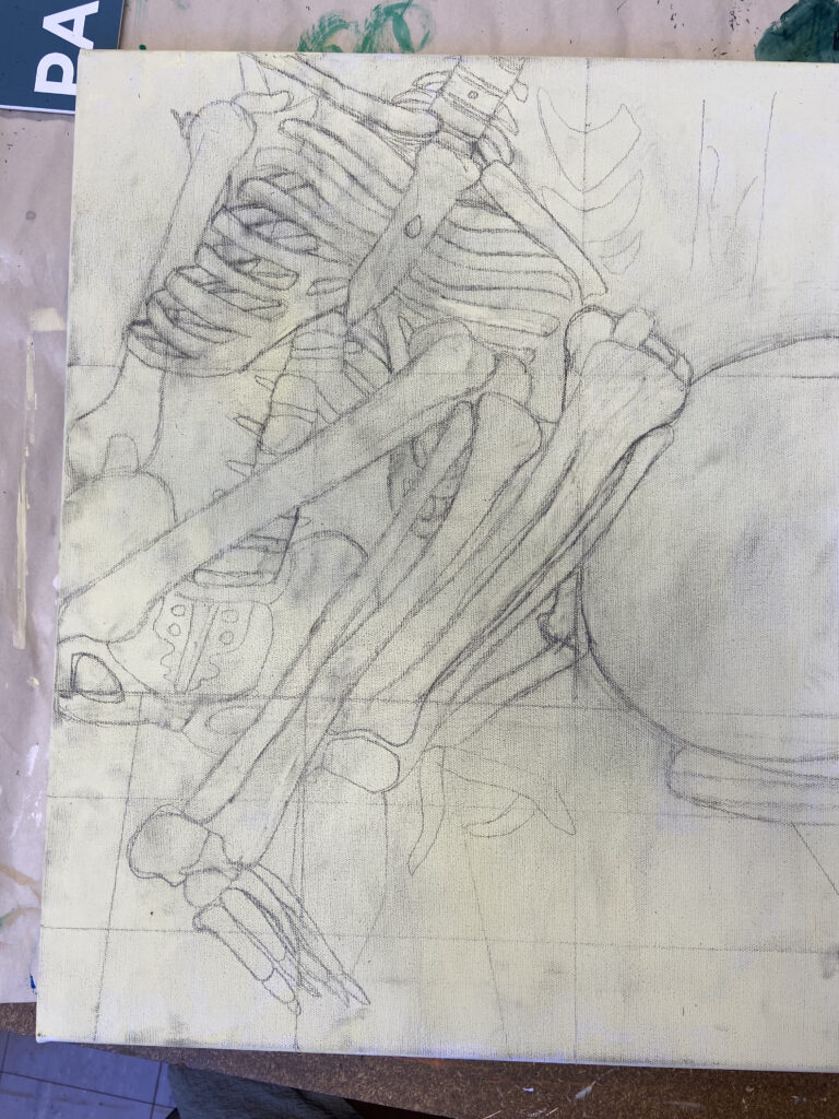
I began this project with a completely different idea than the one I ended up with. I got a significant amount of the way through the first idea. However, it wasn’t turning out how I wanted it at all, and I was not motivated to work on it at all. Around two weeks before it was due, I started over completely with an idea that heavily motivated me and better suited my style. I have been inspired by Kaethe Butcher’s art since I first saw it, years ago. I love the accent lines she uses to create movement in the figures, as well as the text she uses to give the works personal meaning. Her primary medium is India ink on paper, and well as relief printing. She is a contemporary German artist.
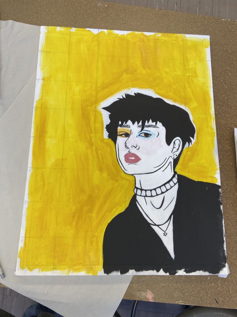
I began the process by reviewing Butcher’s work and thinking about the specific works that inspired me the most. I then found pictures in my camera roll that I felt fit the style, and then drew sketches of my idea in ProCreate on my iPad. I proceeded to painstakingly make grids on my canvas so I could accurately proportion the figures. Then, I gessoed over the grid and preliminary drawings. The next step I took was to do the line work of the face, and then paint over it with white. One thing I really struggled with in the first painting, with the first idea I did, was getting the face right with no guidelines. So, I learned from my mistake and did the line work first. After doing the white, I redid the black line work, then I did the white of the skin, and the black of the hair and the shirt. Then, I did the orange and blue eyeshadow, the lips, and the pink tint of the cheeks. For the background, I did a yellowish underpainting for the gold so it would be more opaque, then covered it in the gold. The final step was the text, which I printed out and modpodged on.
The biggest struggle with this work was getting the line work clean enough, in the style of Kaethe Butcher. I figured out that to get the line work smooth and clean, I had to slightly dilute it with water. However, I still struggled to get the extremely thin line work characteristic of Butcher’s work.
The idea for the text came to me because I really struggle with a need for control, and I wanted to give the self portrait more meaning.
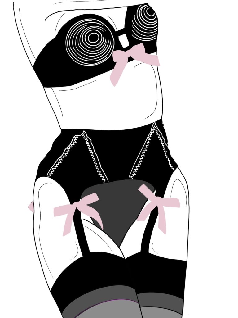
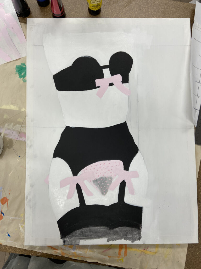
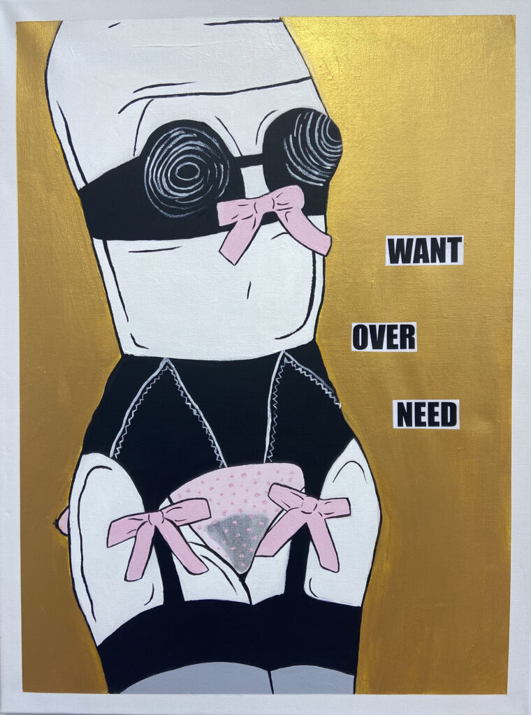
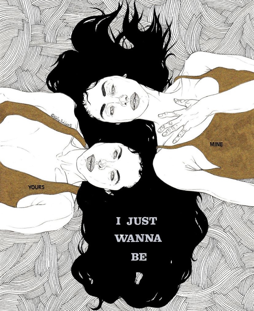
The process for this painting was very similar to that of the self portrait, beginning with line work, blocking out the colors, then going over the line work again. My favorite part of this work was making the sheer underwear with the dotted detailing. The thing I struggled with most was the white detailing on the underwear set. Even though I diluted the paint slightly with water, the white paint was not as smooth nor as opaque as the black, and I couldn’t get as high line quality as I could with the black.
The idea for the text was based off of the text for the self portrait. They are both themed off of personal desire, but in very different ways and contexts. I found that they gave the work more meaning, while also being open to interpretation by the viewer.
Overall, I am extremely satisfied with both my self portrait and my final. I think they illustrate my style well, as well as Kaethe Butchers. Having already started over, and creating an entirely different project, I would not choose a different artist than Kaethe Butcher.